9.1 The design language
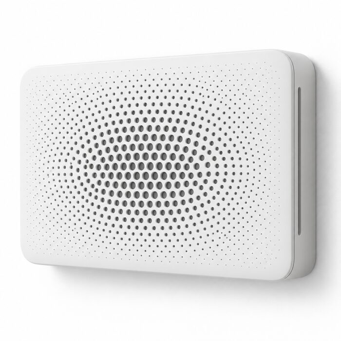
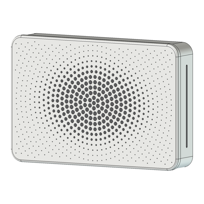
I call it Neo-Braun. I named it on 13 October, after the concept for my cat W/C air filter: a white wall slab whose only decoration is a pattern of holes. It's minimalist industrial design in the Braun and Dieter Rams line ("less, but better"), the way current consumer electronics do it: Muji and Naoto Fukasawa's "Super Normal", Xiaomi's Mi Home range, the Apple HomePod, IKEA's FÖRNUFTIG air purifier.
It's only for physical products and their CAD models. Screens, web pages and dashboards don't follow it.
The rules
- One volume. A monolith or a slab with a rectilinear plan. No joins, screws or controls on show.
- Soft edges. The plan corners have a radius of about 10% of the shorter side, and the front edge a small round, about 5 mm. Rounds, never chamfers.
- Floating front. The front panel overhangs the body by 1 to 3 mm a side, over a shadow gap of about 1 mm, so it reads as floating.
- One colour, one material, one finish. Matte, tone on tone, so the object fades into the wall behind it. One small status light at most.
- Ornament is function. The perforation is the only decoration, and it has a job: air, sound, light or heat.
- Radial halftone. One pitch. The hole size makes the tone, not the spacing. The biggest holes sit at the focal point, over the part that works (the fan, the driver, the sensor), and shrink to small dots towards the edges. A plain border stays clear of holes.
- Hidden function. Outlets go in a side, cables leave at the back, fixings hide behind. Controls go on a side or in an app.
- Calm. No text or logo on the front, no labels, nothing that asks for attention.
And what it rules out: an even grid of holes over the whole face, hex grilles, slots on the front, gloss, chrome, two-tone bodies, RGB light, chamfers, visible screws and any decoration that doesn't do a job.
The halftone
The perforation is the one place the style allows itself something to look at, so it's worth getting right. The holes sit on concentric rings at one pitch. Each hole's diameter is largest at the focal point, holds there for a short way, then falls on a cosine to the smallest size and stays there. Because the spacing never changes, the eye reads the size change as a gradient, like a halftone print.
On the air filter's 440 × 290 mm front that's 763 holes on a 12 mm pitch, from 9 mm at the centre to 1.6 mm at the edge. The open area is 10.4% of the face overall, 44% at the centre and 1.4% at the edge. So the pattern also puts the open area where the fan needs it.
Written down for the agents
A style in my head doesn't help an agent session that starts from nothing. So it's written up as a short set of rules the agents load before they design, model, render or write an image prompt for a product. With the rules come:
- the hole layout as a small script, so every pattern is computed, not drawn;
- how to model it in FreeCAD: perforate a thin 2 to 3 mm skin over a pocket with something dark behind, because deep holes seen at an angle show only their walls and read as bumps;
- how to print it: the perforated face flat on the bed, so every hole is vertical and round, and a test coupon of the smallest hole first;
- one render setup: orthographic, turned 30° right of the front, tilted 6° down, on white;
- prompts for concept images, changed one thing at a time;
- a checklist to review a design against.
The point is consistency. Two sessions on two projects should produce things that look like they came from the same studio. 9.2 is the first time I've applied it to something that isn't an air filter.